I’ve shown you processes before. But when I was working on my HeroesCon Auction artwork I took more photos of process than I normally do. So I wanted to share and describe this process to you.
What makes this different than past processes is that normally I do much if not all of my artwork digitally. But for the auction I needed to create a one of a kind piece of original art. This required that I change up my process, and here’s how it changed:
STEP 1: DIGITAL COMPOSITION SKETCH
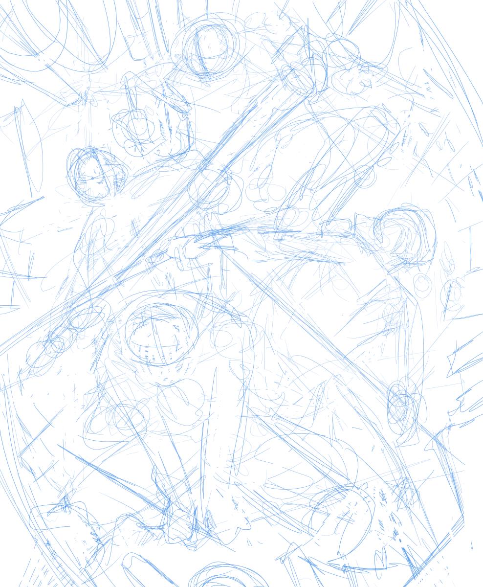
I do this often, but usually not digitally. I just roughly figure out the poses and composition I want everyone to take. I don’t really worry about how sloppy or messy it is. As long as I know what I’m looking at it works for me! When I do this I normally draw it in my sketchbook rather small so I can do multiple different sketches next to each other to compare, contrast, and maybe combine. But there’s a reason I did this one digitally…
STEP 2: DIGITAL LOOSE PENCILS

I rather liked the composition I had in step one and didn’t want to re-draw it all. So I created a new layer in Manga Studio and just loosely penciled right over the blue composition lines. This allowed me to not have to do extra work re-drawing everything from scratch, but I also I didn’t have to deal with the super sloppy lines of the composition. AKA I can turn off the composition layer to look at my pencils.
STEP 3: CLEAN UP & BLUE LINE

So once I’ve loosely penciled the piece I remove the messy composition layer, and convert the pencil layer to blue. Remember: I want to have a one of a kind original piece of art when I’m done. So far it’s a digital drawing. So we have to make it original. I’m going to print this piece of art on a piece of 13 inch by 16 inch bristol board and I’m going to finish the art by hand. The blue lines will be important here because I can make them light enough to nearly disappear once the dark black lines will be put on top of them. They’ll still be visible but hardly noticeable unless you’re looking for it.
STEP 4: PRINT IT OUT

So this is what it looks like printed out on the bristol board. You can see how light the blue looks on the page. You can also see how hairy my arm is.
For inking I’m going to use a Kuretake No. 13 Fountain Brush Pen. They’re hard to control if you’re used to multi liner pens, but if you have patience and controlled touch you will be able to get such beautiful strokes of ink. Lines a multi-liner pen can’t possibly give you the same line variation in one stroke. But also note that I don’t think there is anything wrong with Multi-Liners. I use one to draw straight and even lines like on the sword and bo staff.
STEP 5: INK RAPH

Here I’ve just finished inking Raphael. Hopefully now you can see how the ink lines compare to the light blue lines. They almost disappear in comparison.
STEP 6: INK LEO
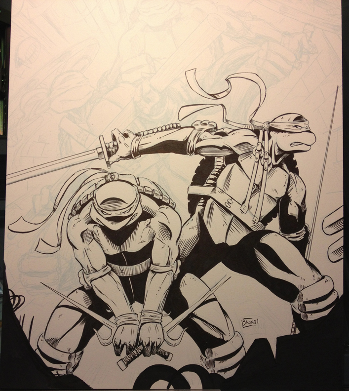
So I hope by now you can see how this piece is taking shape. I’m not going to bore you with each turtle individually. Lets just skip to where the whole piece is inked…
STEP 7: COMPLETE INKING
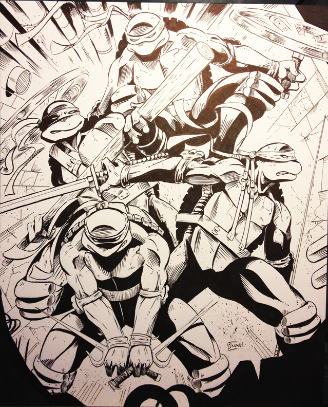
So here’s the whole piece inked. Don’t be fooled. I didn’t use any neat inking technique to show that lighting special effect. That’s literally just the light from my drawing table reflecting off what is still slightly wet ink. So the ink is still wet in places. So we’re going to sit around and let it dry for a little bit before we finish the art.
….
Okay that should be enough time!
STEP 8: FINISH ART!

I’m a huge fan of the Teenage Mutant Ninja Turtles as they appeared in their original comic book. In that comic they all wore read masks. Turns out I always show my age when I say this, as younger fans only know them with their Blue, Purple, Orange and Red masks and think I’m crazy for giving them all red masks. But that’s how they started, and that’s how I like them. Not to mention there is just something so striking with black and white art with the bright red.
So i used a Copic marker Cadmium Red for all the masks. I also felt the piece needed a little old school screen tones applied for some texture. So… that was a tedious process…
If you don’t know the old ways of applying screen tones, or zip-a-tones as they’re sometimes referred to, were with transfer sheets that either had to be cut and pasted onto the page, or in this case physically rubbed off onto the page. SO yeah… I did that. Probably wont’ do that again any time soon.
So VWALLA! We have our original piece of art!
If you have any questions on my process, tools, or techniques feel free to ask me in the comments below!
If you have any other requests on tutorials I should do in the future also feel free to leave me comments!
In the mean time check me out around the web:
COMICS • FACEBOOK • TWITTER • TUMBLR • BACK ISSUES
And remember: Make Comics Not Excuses!
Whoa. What? “Print it out on Bristol board”? You can just run it through a regular inkjet without mangling either the Bristol board or the printer?
Yup! Most photo inkjets today are made to handle thicker photo paper. Bristol board normally isn’t any thicker than that.
Now every printer is different. so make sure it can handle thicker paper. Usually there will be a setting for “Presentation board” or “cardstock” that’s how you know it can handle thicker paper.